Used to make a info card.
Usage
- color=
The 'Theme' color for this card. Can be any valid CSS color(e.g. #E4F0F7, red, rgba(0,0,0,0.3)), or one of the following shoutcut keywords: melee( ), ranged/ranger( ), magic/mage( ), summoning/summon/summoner( ), thrower/throwing( ), healer( ), bard( ), terraria( ). If omitted, the default value is #AFCFE2( ).
- image=<filename> or imagealt=<wikitext>
Image info for the "minicard".See the diagram and examples below. Only one of them will be used, and {{{image}}} take priority.
- icon=<filename> or iconalt=<wikitext>
Icon info for the "minicard".See the examples below.
- size=
The width of the "minicard" (without border), The Default value is 250px. If {{{image}}} is used, the value for {{{size}}} must in px, e.g. 250px. If {{{imagealt}}} is specified, the value can be any valid CSS length.
- other paramaters
{{{image}}} or {{{imagealt}}}{{{icon}}} or {{{iconalt}}}(see details below)
{{{cardintro}}}
{{{card_<key1>}}}{{{<key1>}}}{{{card_<key2>}}}{{{<key2>}}}- ...
- ...
{{{cardoutro}}}
{{{type}}}{{{name}}} {{{namenote}}}{{{subname}}}{{{intro}}}
{{{index_<keyA>}}}{{{<keyA>}}}
{{{index_<keyB>}}}{{{<keyB>}}}
{{{index_<keyC>}}}{{{<keyC>}}}
......
{{{outro}}} or {{{text}}}
Minicard mode vs Icon mode:
| Code | Result | |
|---|---|---|
| Minicard mode | {{infocard
|type=Mode
|name=Minicard
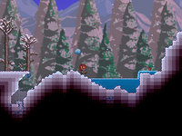
|image=Walkthrough Snow.png|size=200px
|card_a=Title
|a=Content
|text=Text content.
}}
|
Mode Minicard Text content. |
| Custom minicard mode | {{infocard
|type=Mode
|name=Custom Minicard
|imagealt=
<div style="
padding: 20px 20px 0;
background:#61BBC2;
margin-bottom: -10px;">
[[File:Moon Lord.png|160px|link=]]
</div>
|size=200px
|card_a=Title
|a=Content
|text=Text content.
}}
|

Mode Custom Minicard Text content. |
| Icon mode | {{infocard
|type=Mode
|name=Icon
|icon=Bookcase (placed).png
|text=Text content.
}}
|
Mode Icon  Text content. |
| Custom icon mode | {{infocard
|type=Mode
|name=Custom Icon
|iconalt=
{{flexbox
|css=width:80px;
height:80px;
background:#fff;
border:1px solid #ccc;
border-radius:100px;
|alignitems=center
|justify=center
|[[File: Map Icon Moon Lord.png|link=]]
}}
|text=Text content.
}}
|
Mode Custom Icon  Text content. |
See tgc:Guide:Walkthrough for examples.
{{infocard/box}}
You can use {{{infocard/box}}} to create boxes in {{{intro}}} and {{{text}}} if needed.
Note: The boxes created by {{{infocard/box}}} has no margin, and you may add margin: 1em 0 manually.
For example:
{{infocard
|type=Sample
|name=Boxes in text
|intro=Intro start {{infocard/box|a box in intro}} Intro end
|title_box=Title
|box=
some text in box.
{{infocard/heading|Chapter Heading}}
Chapter text
|outro=
Outro start
{{infocard/box|title=box title|box 1 in text}}
Some text
{{infocard/box|box 2 in text|css=background:#ffeeee;color:#ff0000}}
{{infocard/heading|More complicated layout:}}
{{flexstart|justify=justified|css=margin: -0.5em;}}
  {{infocard/box|box A|css=width: 200px;margin: 0.5em;}}
  {{infocard/box|box B|css=width: 200px;margin: 0.5em;}}
  {{infocard/box|box C|css=width: 200px;margin: 0.5em;}}
  {{infocard/box|box D|css=width: 200px;margin: 0.5em;}}
{{flexend}}
{{infocard/heading|Even nested:}}
{{infocard/box|css=background:#eeffee;
|title=Nested boxes
| {{flexstart|justify=justified|css=margin:-0.5em;}}
    {{infocard/box|box W|css=width: 250px;margin: 0.5em;}}
    {{infocard/box|title=X|box X|css=width: 250px;margin: 0.5em;}}
    {{infocard/box|box Y|css=width: 250px;margin: 0.5em;}}
    {{infocard/box|title=Z|box Z|css=width: 250px;margin: 0.5em;}}
  {{flexend}}
}}
You can change the "theme color" of boxes if needed:
{{flexstart|justify=justified|css=margin: -0.5em}}
  {{infocard/box|title=Melee|Melee box|css=width: 200px;margin: 0.5em;|color=melee}}
  {{infocard/box|title=Ranged|Ranged box|css=width: 200px;margin: 0.5em;|color=ranged}}
  {{infocard/box|title=Magic|Magic box|css=width: 200px;margin: 0.5em;|color=magic}}
  {{infocard/box|title=Summoning|Summoning box|css=width: 200px;margin: 0.5em;|color=summoning}}
  {{infocard/box|title=Other|Other box|css=width: 200px;margin: 0.5em;|color=#F7E268}}
{{flexend}}
Text end
}}
will render as:
a box in intro
some text in box.
Chapter text
Outro start
box 1 in text
Some text
box 2 in text
box A
box B
box C
box D
box W
box X
box Y
box Z
You can change the "theme color" of boxes if needed:
Melee box
Ranged box
Magic box
Summoning box
Other box
Text end